


A colour profile is an ICC file describing exactly how a device or space renders colour, so software can translate an image predictably between camera, screen and printer. Most colour problems disappear once three habits are in place: calibrate the monitor, embed the profile on every export, and match the export space to where the file is actually going.
The rest of this is how those three turn into a routine you can run on every job, and what to check when a client says the colours look wrong.
What a colour profile actually is
An ICC profile isn’t the same thing as a colour space, though the terms get used loosely. A colour space — sRGB, Adobe RGB — is an abstract description of a gamut, the range of colours available. A profile is the measured description of how one real device reproduces colour: your particular monitor, your particular printer, a given paper stock, warts and all.
Colour management software translates between them through a profile connection space, a device-independent reference point. The colour management module does the maths, reading the source profile, passing values through that reference, then converting them into the destination profile’s numbers. It is what lets a file shot on a Nikon look right on a calibrated screen and right again on a completely different printer.
It only works when profiles are embedded and devices are measured rather than assumed. That is the accepted standard for photographic colour management, and almost every colour complaint traces back to one of those two steps being skipped.
Which colour space should you use, and when?
sRGB is the narrowest of the common spaces and the safest default for anything going to a screen. Nearly every browser, phone and social platform assumes it, so files without an embedded profile get treated as sRGB regardless.
Adobe RGB (1998) covers a wider slice of greens and cyans, useful for magazine and commercial print where a press can reproduce more than a monitor shows. ProPhoto RGB is wider still, covering colours no display or printer can currently show — a superb working space for retouching, a poor delivery space. Display P3 matches what Apple’s screens and cameras use, which makes it a sensible export for a Mac and iPhone-heavy audience.
- sRGB — web galleries, social, most client screens
- Adobe RGB — commercial and magazine print pipelines
- ProPhoto RGB — high-end retouching working space, never a final export
- Display P3 — Apple-ecosystem delivery, a practical option when most of your audience is on Mac or iPhone
One rule worth holding onto: never edit in ProPhoto RGB at 8-bit. A wide gamut spread across so few tonal steps per channel bands quickly. Work in 16-bit whenever you touch a wide-gamut space, then convert down for delivery.
Does your camera’s colour profile matter if you shoot RAW?
Picture styles — Canon’s Standard, Fujifilm’s Classic Chrome — only bake themselves permanently into JPEGs. On a RAW file that style is a preview instruction, a suggestion the camera screen and your raw processor’s default thumbnail use before you’ve made any decisions.
The RAW file is closer to unprocessed sensor data. White balance, profile, tone curve: all of it happens later in Lightroom or Capture One, and all of it can be revisited. So set an in-camera style that helps you judge exposure and expression on the day, and don’t treat what you see on the back of the camera as locked colour.
How to calibrate your monitor properly
Monitors drift. Backlights age, factory settings assume a showroom rather than your studio, and a screen that looked neutral six months ago can carry a warm cast you won’t notice, because your eyes adapt to it. That is why hardware calibration with a colorimeter beats judging by eye, even on a screen that shipped close to spec.
- Warm the monitor up for at least twenty minutes before measuring.
- Attach a colorimeter — an i1Display or a SpyderX are the usual choices — and run the measurement pass.
- Build the profile targeting a D65 white point and gamma 2.2, with luminance tuned to your room lighting rather than maxed out.
- Load the new profile, then check it against a reference image or a printed proof you trust.
Quarterly is the minimum, more often if your studio light changes with the seasons. A calibration that was accurate in January will have moved by summer.
Assign or convert? The difference that causes most complaints
Assign Profile changes the meaning of a file’s existing numbers without touching them. It is only useful when a file is mistagged or has no profile at all. Convert to Profile does the opposite: it recalculates every pixel so the image looks the same but now speaks a different profile’s language. You convert when the destination genuinely changes — moving from a wide editing space to sRGB for the web, for instance.
Skip that step and the exported file gets read as generic sRGB by whatever opens it next. Fine if that’s what you meant; jarring if it wasn’t. Adobe’s own guidance is to preserve embedded profiles and reach for Convert to Profile specifically when the output changes.
- Assign only to fix a mistagged or profile-less file, never as a routine step.
- Convert whenever you move from a working space to a delivery space.
- Embed the final profile on export, no exceptions.
- Soft-proof against the destination before anything goes to print: download the lab’s ICC profile, view the image through it, correct anything that clips or dulls, then export with the rendering intent the lab asks for — usually Relative Colorimetric.
Managing colour profiles in Lightroom and Photoshop
- In Lightroom, open the Profile Browser before you touch another slider and pick a camera-matching or Adobe profile. Applying the profile first means every edit after it reacts to the right base colour instead of fighting a mismatched default.
- Save a favourite profile as a preset if you shoot a consistent look across many sessions — a studio headshot day, for example.
- In Photoshop, use Convert to Profile when preparing a file for a different destination than the one it was edited in.
- Keep Assign Profile strictly for files that arrived mistagged or untagged.
- In Colour Settings, tell Photoshop to preserve embedded profiles and to ask on a mismatch rather than silently converting. The file habits that keep embedded profiles intact matter as much as the settings once a shoot generates hundreds of files.
A practical colour checklist for client work
- Capture — shoot RAW, put a ColorChecker in the first frame on product and commercial jobs, and set an in-camera preview that helps you judge the shot on location.
- Edit — calibrate first, choose ProPhoto RGB or Adobe RGB depending on the job, and stay in 16-bit throughout.
- Export — soft-proof against the destination, convert to the lab’s profile for print or to sRGB or Display P3 for screen, and embed the profile every single time.
- Deliver — spot-check on a couple of ordinary devices, or order a physical proof before a large print run.
How we keep colour consistent at Dock Street Studio
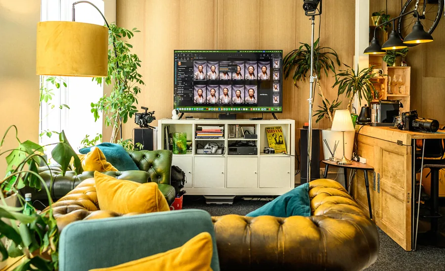
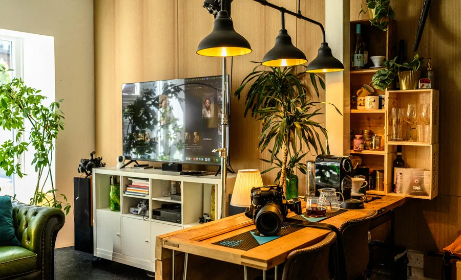
Our own routine is the checklist above, run the same way every time. We shoot tethered into Capture One so colour is judged on a calibrated screen at frame one rather than discovered at frame eighty. Product and commercial jobs start with a reference target in shot. Retouched selects go out within 48 hours, so clients are looking at accurate files while the shoot is still fresh.
None of that is talent. It is routine — calibrate on a schedule, embed without exception, soft-proof before export.
— Mark
How colour profiles affect print quality and paper choice
Every combination of printer, ink and paper produces a different result from the same file, which is why printer profiles sit as a separate layer from the working-space question. A profile built for gloss won’t render correctly on matte fine-art stock; absorbency and surface texture change how ink sits and how light comes back off it, shifting both the achievable gamut and the perceived contrast.
Labs typically supply an ICC profile for each paper and printer combination they offer, and increasingly accept RGB files directly rather than demanding a manual CMYK conversion. Standardised press profiles — SWOP and GRACoL in North America, FOGRA and ECI in Europe — exist because presses need a common target that isn’t tied to one machine.
The routine: download the profile for your paper and printer, soft-proof against it, and watch for two things — colours that clip or shift hue, and shadow detail blocking up. Correct locally rather than reaching for a blanket saturation boost, then export with the intent the lab specifies. Matte papers usually need a slight contrast lift to compensate for a lower dynamic range; gloss and lustre handle deep shadows and saturated colour with far less compromise.
Why colours shift unexpectedly, and how to fix it
Most unexplained shifts trace back to a handful of repeat offenders, and diagnosis is elimination rather than guesswork.
- Missing embedded profile — the file is read as generic sRGB by the next piece of software, shifting anything edited in a wider space.
- Non-colour-managed software — older browsers and some default image viewers ignore embedded profiles and display the raw numbers as if they were sRGB.
- Uncalibrated monitor — you are correcting against a screen that is lying to you, so every edit compensates for a fault that isn’t in the file.
- Wrong rendering intent — Perceptual compresses the whole gamut and can mute saturated colour; Relative Colorimetric clips out-of-range colours instead, which usually suits photography better.
- Double conversion — sRGB to Adobe RGB and back loses information at each step and leaves drift that is hard to trace afterwards.
GIMP’s documentation makes a point worth generalising: turning colour management off doesn’t remove colour interpretation, it just forces a built-in assumption onto files that may need something else. When a client says the colours look off, check whether the file has an embedded profile at all, then check what opened it.
What happens to colours outside a profile’s gamut
Gamut mapping is what a colour management module does when a colour exists in the source space but has no equivalent in the destination — a vivid ProPhoto teal, say, that Adobe RGB cannot represent. Something has to be substituted, and the rendering intent decides how.
Perceptual scales the whole image’s colour relationships proportionally, compressing everything slightly so nothing clips abruptly. It suits images with large areas of intense colour. Relative Colorimetric leaves in-gamut colours untouched and pulls only the out-of-gamut ones to the nearest reproducible equivalent, which is why most labs ask for it. Absolute Colorimetric is mainly a proofing intent, preserving the source white point rather than adapting to paper white, and Saturation prioritises vivid colour over accuracy — business graphics rather than photographs.
Soft-proofing shows this happening in real time. Photoshop and Lightroom both offer an overlay that highlights which pixels will clip under your chosen intent before you commit. Catching that on screen rather than when the print comes back is the whole reason soft-proofing against a lab profile is the highest-leverage step in the process.
What hardware you need beyond a calibrated monitor
A colorimeter handles monitor calibration well, but it isn’t built to measure printed output, fabric, or products under studio light. For that a spectrophotometer is the tool that matters — it measures light reflected off a physical surface across the visible spectrum rather than light emitted by a screen.
Spectrophotometers are what generate printer and paper profiles in the first place: print a target chart, scan it, and the software builds a profile from the deviation between what was printed and what was intended. Worth owning if you print regularly across several paper stocks rather than relying on a lab’s supplied profile.
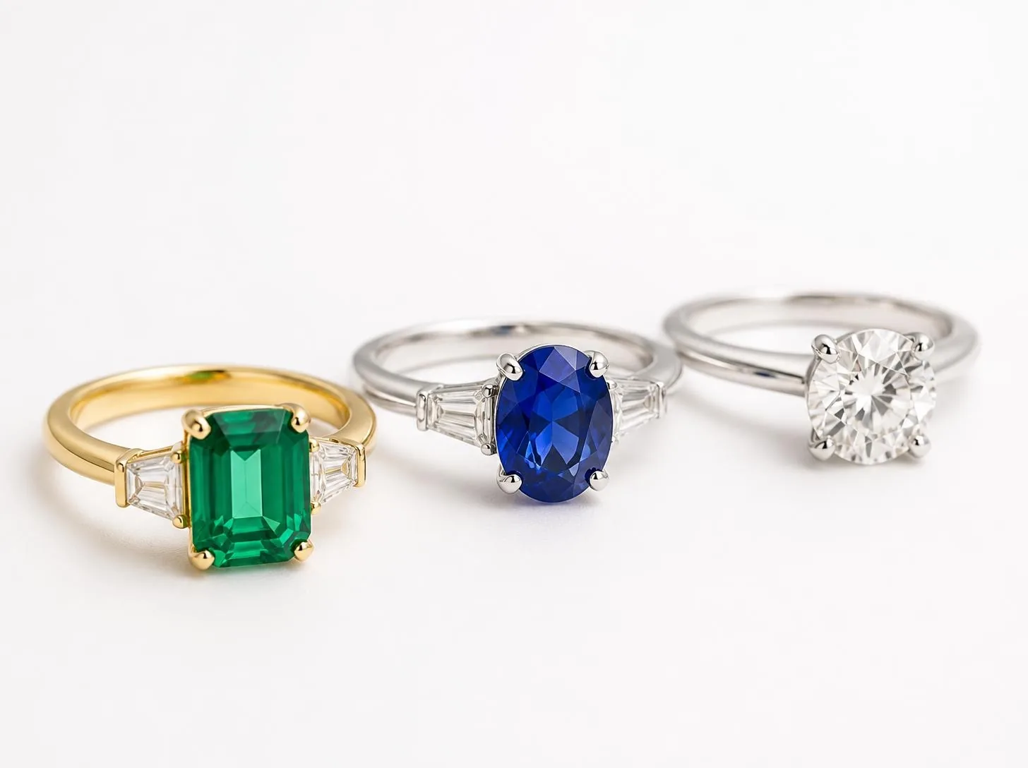
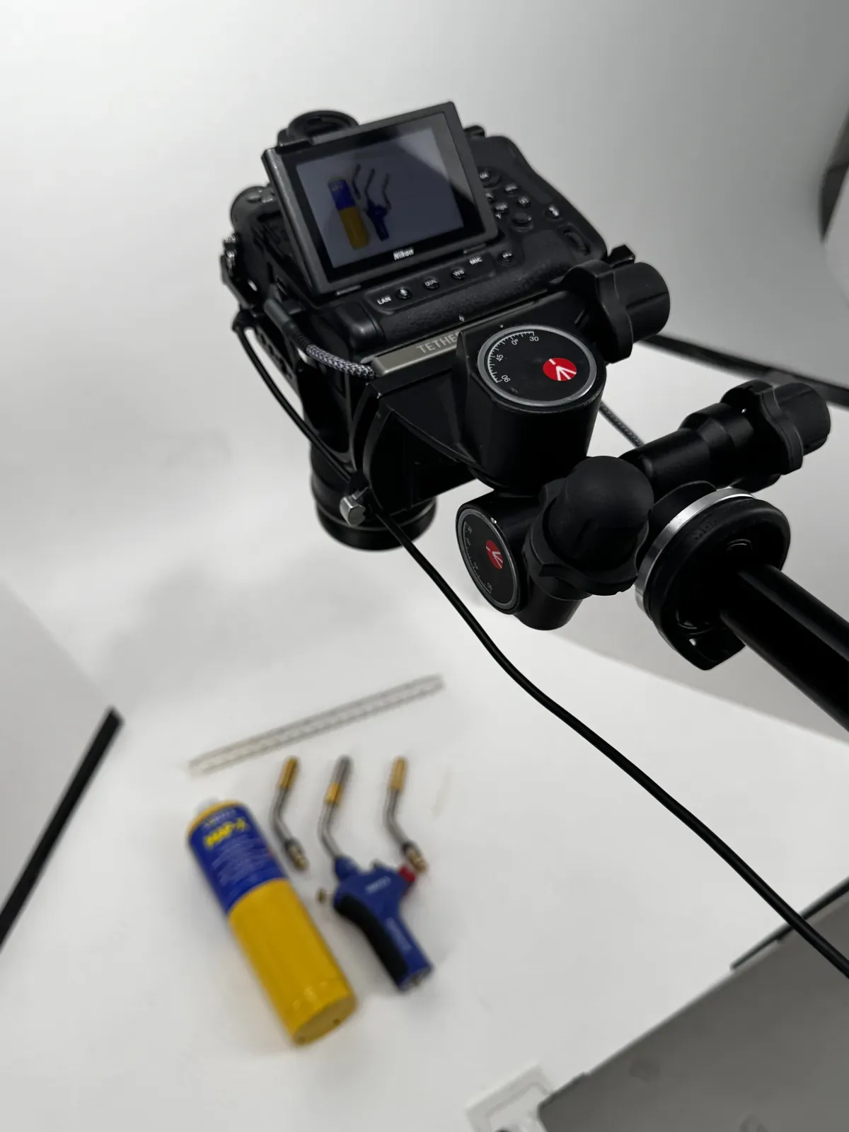
A physical ColorChecker belongs in the kit too — not for calibration but for verification during a shoot. Photographed alongside the product, it gives you a known reference to correct against later, which matters most on e-commerce and packshot work where a client will notice if the product drifts from the photograph. Packshots lit with colour accuracy in mind start with exactly that frame.
Ambient light matters as well. A basic light meter, or even a lux app on a phone, tells you whether the room is consistent enough that your monitor’s calibrated luminance matches what you are actually seeing under it.
Frequently Asked Questions
What are the different types of colour profile?
Input profiles describe cameras and scanners, display profiles describe monitors, and output profiles describe printers with a specific paper and ink. Working spaces — sRGB, Adobe RGB, ProPhoto RGB, Display P3 — sit alongside these and define the gamut you edit or deliver within.
Where do you get colour profiles from?
Monitor and printer manufacturers ship basic profiles with their drivers, but for accuracy you build your own monitor profile with a colorimeter. Print labs publish their paper and printer profiles for download, usually in the support section of their site, so you can soft-proof before submitting a file.
What’s the best colour profile to use?
There isn’t one. It depends where the file is going: sRGB for web and social, Adobe RGB or ProPhoto RGB for editing and commercial print, Display P3 for Apple-ecosystem galleries.
Do I need to embed a colour profile on every export?
Yes. A file exported without one gets read as generic sRGB by whatever opens it next, which causes most of the shifts photographers assume are a bug.
Where is the studio, and how do we book?
We’re at Dock Street Studio, Unit 9, 30–38 Dock Street, Leeds LS10 1JF — a short walk from Leeds station, with parking on site. Bring the products or the brand colours you need matched, and we can go through it before anything gets shot.
Hand the colour workflow to a studio that already runs it
Web galleries and social posts tolerate small drift; nobody compares an Instagram feed against a swatch book. A framed print or a brand’s flagship product shot is a different calculation, where a visible shift is the difference between approval and a reprint. Buy calibration hardware once you are delivering colour-critical work regularly; until then, lean on your lab’s profile and the checklist above.
If running it yourself is more overhead than the next shoot needs, our commercial photography in Leeds already runs a calibrated, soft-proofed workflow from £450, with retouched images back within 48 hours. Book online, email hello@dockstreetstudioleeds.co.uk, or call 0113 4400102.
Sources
- ASMP digital photo guide — ICC workflow and standards
- Change color profile for documents — Adobe
- ICC profile colour-management workflow — Tov Studio Photo
- Monitor colour accuracy and calibration — TourBox
Related reading
- The Art of Image Editing
- Flash vs Continuous Lighting
- Best Lighting for Packshots
- How to Photograph Reflective Products
- Product Image Types Explained
- Photography Studio Hire in Leeds
Written by Mark Wheelwright
Commercial photographer & studio owner, Leeds | ISO Photographic Ltd
Dock Street Studio, Unit 9, 30–38 Dock Street, Leeds LS10 1JF
18+ years’ experience | 900+ projects | 300+ five-star reviews | 1M+ shutter count
dockstreetstudioleeds.co.uk
Shot, written and built by the Dock Street team
Every guide on this blog comes from the team at Dock Street Studio — Mark behind the camera with 18+ years' experience, Nicole on styling and lighting, Beya on video and bookings and Austin keeping the site fast and findable. If you'd rather have us do it than read about it, book a session or explore our photography services in Leeds.