


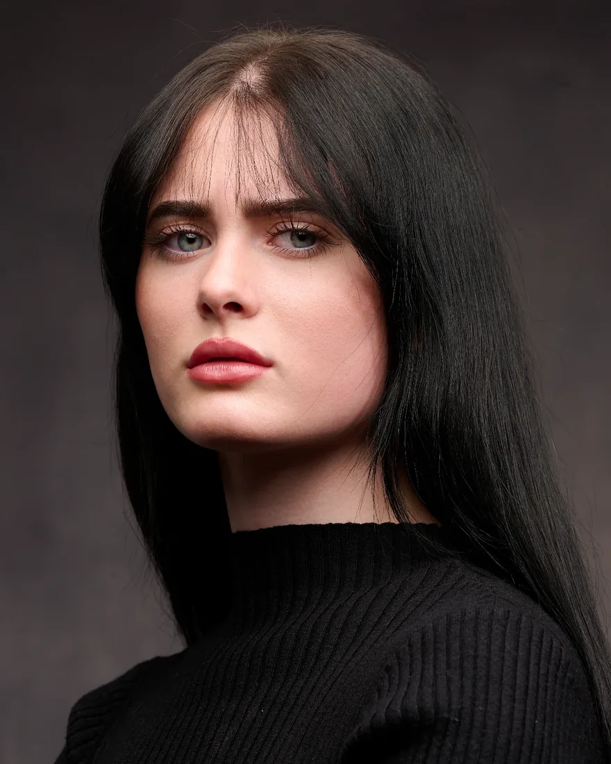
For most professional headshots, a mid to light neutral grey or a softly blurred office background is the safest choice. It reads as competent and current without competing with your face. Everything else here — studio setups, colour, platform quirks — is a set of exceptions to that default, and knowing when to break it is most of the skill. Good headshot backgrounds are chosen backwards, from where the picture will end up rather than from what looks nice on the day.
The short version
- Neutral grey or a soft office blur is the safest default, particularly for LinkedIn.
- Studio backdrops win for teams and directories, because one setup repeats across thirty faces.
- Navy reads as authoritative, charcoal as formal, white as clean but unforgiving, brand colours as on-brand but quick to date.
- Never let your clothing sit in the same tonal family as the backdrop.
- Bokeh adds dimension to a single portrait and causes trouble across a team day.
Contents
- The three kinds of headshot background
- What background colours actually say
- Choosing headshot backgrounds for the platform they will live on
- Backdrop materials, and how we light them
- Making it work at 100 pixels wide
- Skin tone, wardrobe and the separation rule
- Texture, personal brand and what has actually changed
- Doing it yourself, and when that stops being sensible
- Seven briefs you can hand straight to a photographer
- How we handle backgrounds at Dock Street Studio
- Mark’s take
- Sources
- Frequently Asked Questions
The three kinds of headshot background
Every background falls into one of three groups: environmental, studio, or added afterwards in post. Knowing which one your brief needs saves a reshoot later.
Environmental backgrounds use a real place — an office corridor, a brick wall, a park. They suit personal branding and editorial portraits, where you want the picture to say something about the sitter’s world. The trade-off is control. Light shifts through the day, people wander into frame, and no two sittings match.
Studio backgrounds use paper, canvas or fabric, lit deliberately in a room you control. This is the default for directories, LinkedIn and casting, because it repeats. Ten people can sit against the same grey paper under the same lights and come out looking like a set. Adobe’s guide to headshot backgrounds treats these three groups as the basic toolkit, and that matches how we brief a shoot.
Post-production backgrounds are swapped or blurred after the fact. They help when you need to refresh an existing photo library without getting everyone back in, but they rarely fool a careful eye, and mismatched lighting between subject and background gives them away.
Which one fits depends on the job:
- Personal brand or acting reel? Environmental, or a considered studio set.
- Company directory or team page? Studio, every time.
- Casting for film, television or commercials? Studio, genuinely neutral. Casting directors want to see you, not your flat.
- Refreshing old photos on a budget? Post can bridge a gap. It is a stopgap rather than a plan.
Team shoots make the case hardest to ignore. One lighting setup and one backdrop, repeated across twenty or thirty sittings, is the only reliable way to stop a directory page looking like a ransom note.
What background colours actually say
Colour is doing more work than most people credit. Research into first impressions shows that visual cues shape judgements of competence and trust within seconds of a photo appearing, which is roughly the attention a hiring manager gives a thumbnail. Studies on rapid visual judgement bear that out.
Light to medium grey is the safe default because it is genuinely neutral. It does not fight skin tones, wardrobe or brand colours, and it reproduces cleanly on any screen.
Navy reads as authoritative without the coldness of black, which is why so much legal, financial and consulting work leans that way.
Charcoal sits between grey and black: a little more formal, popular for executive portraits.
White feels clean and modern, and it is the least forgiving. It shows lint, shadow and every shift in skin tone, and it blows out under strong light.
Muted brand tones — a soft sage, a dusty teal — work while the images stay inside one company’s own pages. They become a liability the day someone changes jobs and takes the photo with them.
| Background colour | Signals | Watch for |
|---|---|---|
| Light or medium grey | Neutral, modern, approachable | Nothing much. The safest all-rounder |
| Navy | Authoritative, trustworthy | Looks flat under weak lighting |
| Charcoal | Formal, executive | Absorbs light, so needs a stronger key |
| White | Clean, bright, minimal | Shows shadow and skin tone shifts |
| Muted brand tone | On-brand, distinctive | Dates fast if you change roles |
One rule overrides all of it: never match the background to your clothing. A grey suit against grey paper flattens into a single mass with no edge between you and the room.
Choosing headshot backgrounds for the platform they will live on
Work backwards from where the picture ends up.
- Name the platform first. LinkedIn crops to a circle and compresses hard, so texture disappears. A directory needs every face to match. An annual report portrait is usually shown large and alone, so it can carry more weight.
- Match the signal to the role. A junior associate and a managing partner can both sit on navy. The partner’s version usually wants slightly deeper, more formal lighting.
- Check wardrobe against the backdrop before the day, not during it. Bring two options if you are unsure. We can change a backdrop faster than you can change a shirt.
- Think about contrast with skin tone. A backdrop too close to the sitter’s tone flattens the picture; too much contrast pulls the eye off the face.
- For teams, lock one neutral and one lighting setup before anyone sits down. A halo gradient can flatter one person beautifully and then demand the exact same distance and pose from everyone else, which does not hold across twenty sitters. Flat, even light on one mid-grey paper does.
If you are briefing a photographer for a team day, tell us the destination — “these go on LinkedIn and the company website” — rather than just “we need headshots”. That single sentence settles crop, contrast and backdrop.
Actors work to a different convention. Casting directors want a background plain enough to vanish, because the job is to read your face and your range. Our guide to actor headshot backgrounds goes into the casting conventions properly, and our actor headshots page covers how those sessions run.
Backdrop materials, and how we light them
The material matters nearly as much as the colour, a point also made in this overview of individual portrait services and backdrop types. Seamless paper is the workhorse: cheap to replace, available in dozens of colours, quick to swap. Its weakness is the same as its strength. It creases and scuffs, and it needs rolling down fresh more often than people expect.
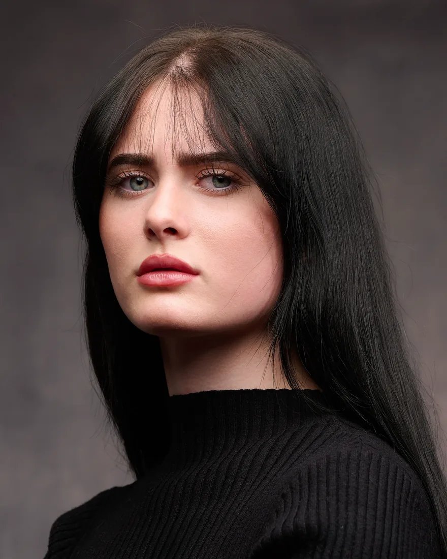
Painted canvas costs more and lasts years, and it carries a subtle texture that flat paper cannot. It suits a studio doing repeat work in one look, less so if you switch colours often.
Printed or branded backdrops — a logo pattern, a textured mural — earn their keep at events and marketing shoots. For headshots meant to travel between platforms they date quickly and pull attention off the face.
Lighting is where the craft sits, and it is how one roll of grey paper becomes three different looks.
- Flat, even light across the paper gives the true, consistent grey most directories want. It is also the quickest setup for volume days.
- Centre-spot or halo gradient puts a pool of light behind the head that fades at the edges. It looks polished on a single executive portrait and is genuinely hard to repeat, because a few inches of drift throws the gradient off centre. Tov Studio Photo’s backdrop guide explains why it needs supervision.
- Unlit backdrop lets the paper fall to near-black for the moody editorial look. It is dramatic and unforgiving of stray hair catching light.
Muslin and other fabrics sit between paper and canvas: more forgiving of wrinkles than paper, easier to carry than canvas, prone to showing fold lines under hard side light.
Where bokeh helps, and where it does not
Background blur comes from a wide aperture — something like f/2.8 or f/1.8 — throwing everything behind you out of focus while your face stays sharp. It depends on three things: aperture, the distance between you and the background, and the focal length of the lens. Stand someone several metres from a window and that detail melts into soft colour.
The catch is consistency. Depth of field shifts with small changes in distance, so blur is harder to standardise across twenty sitters than flat-lit paper. It is a strong tool for one portrait and a nuisance for a directory.
Making it work at 100 pixels wide
Most people will see your headshot at about 100 pixels inside a circle, not full screen. Design for that.
- Crop to head and upper shoulders, with a little room above the crown. Circular thumbnails clip the corners of a square frame, so keep the face centred rather than cropped tight to the jaw.
- Light the face brighter than the background. Equal brightness loses all definition the moment the picture shrinks.
- Keep tonal separation between hair, skin and backdrop. Dark hair on charcoal with no rim light merges into one shape.
- Expect compression. Platforms flatten subtle gradients on upload, so a clean mid-tone with decent contrast survives far better than anything busy.
That first-impression window is short in print and shorter still at thumbnail size, which is why muddy contrast costs you more online than it would on paper. Our guide to LinkedIn headshots in Leeds covers the team side of this in more detail.
Skin tone, wardrobe and the separation rule
Colour theory here comes down to one idea: create separation, not competition, between skin, clothing and background.
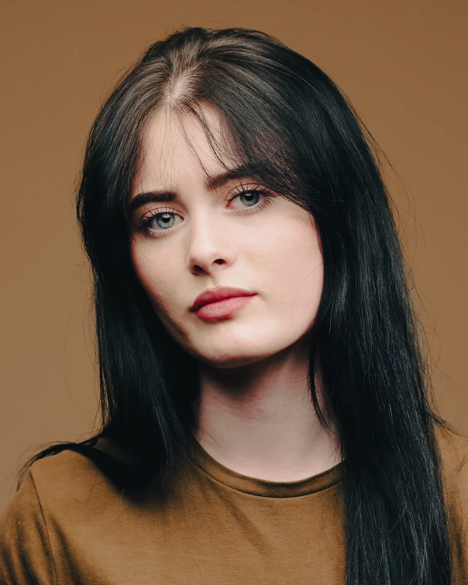
Warmer skin tones usually sit well against cooler backgrounds — blue-grey, navy, a muted teal — because the difference in temperature keeps the face looking warm rather than washed out. Cooler or paler tones often do better on a slightly warmer neutral, a soft taupe or warm grey, which stops the picture going cold under studio light.
Wardrobe matters just as much. Never let clothing and background share a tonal family. A charcoal suit on a charcoal backdrop merges into one shape, which is exactly the failure that costs you definition at small sizes. Solid colours photograph better than fine patterns, which can throw odd moiré effects against some textures.
Jewellery and glasses play a smaller part. Gold tends to sit better on warm neutrals, silver on grey or navy. None of this needs to be exact on the day, but telling us about wardrobe beforehand saves finding the clash on the monitor.
Texture, personal brand and what has actually changed
A textured background pulls the eye. Brick, foliage, patterned fabric — all of it competes with the face, even when the viewer could not tell you why. Smooth, evenly lit backgrounds read as calm, which is most of the reason studio grey became the corporate default.
That said, texture is not automatically wrong. A cracked industrial wall might suit a creative director. Behind a solicitor it sends a slightly chaotic signal that works against the trust a legal client is looking for. The rough principle: the more the role depends on trust — law, accountancy, healthcare, finance — the flatter the background should be.
Your background is a small piece of brand messaging whether you have thought about it or not. Research on colour and branding makes the point that these choices are not decorative. The catch is longevity: a headshot tied to one employer’s palette turns awkward the moment you move on, and neutral ages far better across a career.
Of the recent shifts, the soft blurred office has moved from tech niche to mainstream, and warmer neutrals have crept in as a friendlier alternative to cool steel grey. Guides tracking background trends put the blurred look alongside solid grey as a default now. What has not held up: saturated colour backdrops and novelty patterns, which date quickly and read as try-hard. Treat any of it as an option for a single portrait rather than a reason to abandon neutral paper for team work.
Doing it yourself, and when that stops being sensible
A phone headshot can get you through a week. It rarely holds up for a team of any size, because the value of a studio is repeatability rather than gear.
If a studio genuinely is not an option, keep it simple. Stand a couple of metres from a plain, unpatterned wall. Face a window for soft light rather than standing under a ceiling bulb. Put the phone at eye level rather than shooting up or down. A sheet of white card bounces light back under the chin and does most of what a reflector would.
When you do book a team day, arrive with a shot list: how many people, what each image is for, and any wardrobe or brand constraints. That is the planning that decides whether twenty sitters finish on schedule or run three hours over.
Seven briefs you can hand straight to a photographer
- Mid-grey studio, flat lighting for LinkedIn. Wear solid navy or burgundy, and skip grey or beige.
- Soft blurred office for a modern tech profile. Works better with a fitted blazer than a full suit.
- Charcoal with a subtle centre gradient for an executive portrait. Darker tones, minimal jewellery.
- Plain white, evenly lit for a headshot that sits inside a branded template. Avoid white or cream clothing.
- True neutral grey, no gradient for actor and casting work. Simple, well-fitted clothing in a mid tone.
- Navy backdrop for legal, financial or consulting portraits. A crisp white or pale blue shirt lifts against it.
- Muted sage or teal, but only if the photo stays on one company’s own pages.
The two to avoid: a background that matches your outfit, and anything busy that is headed for a small thumbnail.
How we handle backgrounds at Dock Street Studio
Every session starts with the brief rather than the camera: what the pictures are for, where they will live, and which backdrop and lighting setup actually serves that. It is dull groundwork, and it is what keeps a twenty-person day on schedule instead of unravelling into a debate about paper colour halfway through.
We shoot tethered into Capture One, so you see the frame on a big screen while we work rather than squinting at the back of a camera. If the separation between hair and backdrop is not there, we fix it before you leave rather than in retouching. Retouched images are back with you within 48 hours, which matters when there is a launch or a deadline waiting on them.
Individual sessions start at £95 for the LinkedIn Express session, with Quick-Fire Spotlight at £150 and the In-Depth Portrait at £200. For teams, commercial and on-location headshots run at £450 for a half day covering up to 15 sitters, or £750 for a full day covering up to 30, with editing and retouching included. If you would rather bring your own photographer, the same backdrops and lighting are available through studio hire. Our reviews will tell you more about how the sessions feel than we can.
Mark’s take
After 18 years of this, my honest recommendation is mid-light grey or a soft office blur for the overwhelming majority of professional headshots. It is the choice least likely to age badly or clash with anything. Reach for navy when you need to signal weight in finance, law or consulting, and white when a template demands it. Shoot more than one background if the session allows, and treat any headshot older than three to five years as due for a refresh, however good it still looks.
Sources
- How to use backgrounds to level-up your headshots
- PubMed study on first impressions and visual cues
- Color and branding (ColorMatters)
- Headshot background and backdrop selection guide (Tov Studio Photo)
Frequently Asked Questions
What should I avoid in a headshot background?
Busy patterns, heavy texture, and any colour close to your skin tone or your clothing. All three cut contrast and pull attention off your face. If the picture is going on a company directory, also avoid anything that clashes with the brand colours around it.
What is the best backdrop for a LinkedIn headshot?
Light to medium grey paper or a softly blurred office. Both read as neutral and modern, and both hold up under the compression platforms apply when you upload.
Can you change a headshot background afterwards?
Yes, though it is a compromise. Shooting against a real backdrop captures the light on you and the background together, which is why it looks natural. A swap in post has to fake that relationship, and a careful eye usually spots it.
Do actor headshots need a different background?
They need a plainer one. Casting directors want nothing behind you competing for attention, so a genuinely neutral grey with no gradient is the convention, and agents will often ask for it by name.
Where is the studio, and how do I book?
We are at Unit 9, 30–38 Dock Street in central Leeds, a few minutes from Leeds Dock and a short walk from the train station, with parking on site. You can book online, or get in touch and we will talk through what the pictures are for before you commit to anything.
Book a headshot session in Leeds
If you would like a hand choosing the right background, or you have a team day to plan, we are happy to talk it through first. Have a look at Dock Street Studio to see the work, then:
- Book online at dockstreetstudioleeds.co.uk/book
- Email hello@dockstreetstudioleeds.co.uk
- Call 0113 4400102
Related reading
- How to Choose Headshots That Work Harder
- Face Literacy: What Your Headshot Is Really Communicating
- Excel at your Headshot Photoshoot in Leeds
Written by Mark Wheelwright
Commercial photographer & studio owner, Leeds | ISO Photographic Ltd
Dock Street Studio, Unit 9, 30–38 Dock Street, Leeds LS10 1JF
18+ years’ experience | 900+ projects | 300+ five-star reviews | 1M+ shutter count
dockstreetstudioleeds.co.uk
Shot, written and built by the Dock Street team
Every guide on this blog comes from the team at Dock Street Studio — Mark behind the camera with 18+ years' experience, Nicole on styling and lighting, Beya on video and bookings and Austin keeping the site fast and findable. If you'd rather have us do it than read about it, book a session or explore our photography services in Leeds.