


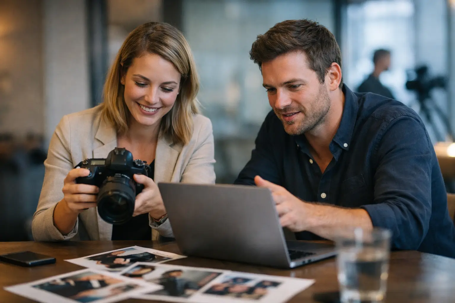
A press release can have a strong story, a clear quote and every fact in the right place, and still get passed over because the picture gives an editor nothing to run. The best images for press releases make the story readable at a glance. They look credible, they reproduce well, and they leave a publication room to crop without losing the point.
We see it often with businesses around Leeds and Yorkshire. Genuinely good news goes out with a dark phone snap, a generic stock photo, or a group shot where nobody can tell who matters. The problem isn't that the business has nothing worth saying. It's that the picture doesn't help a busy editor make a fast decision.
Start with what the announcement is actually about
Before anyone books a shoot, ask the plain question: what is this news? The answer should decide the photograph.
A new appointment usually means the person is the picture. A new product means showing the product properly. A charity partnership, an opening or a community project means photographing the people involved doing something real. The image should add information, not fill a gap beside the copy.
That sounds obvious, but it heads off the most common mistake: trying to fit the whole business into one frame. A managing director, three staff, a branded van, a product and a large logo may all be relevant. They rarely make one clear press photograph. Pick the visual hook, then make it easy to see.
A useful test is that someone glancing at the image small, on a newsroom screen, should get who or what it's about in a second or two. If they can't, it might still be a nice marketing photo, but it isn't doing the job of commercial press photography.
Use real people, and give them a reason to be there
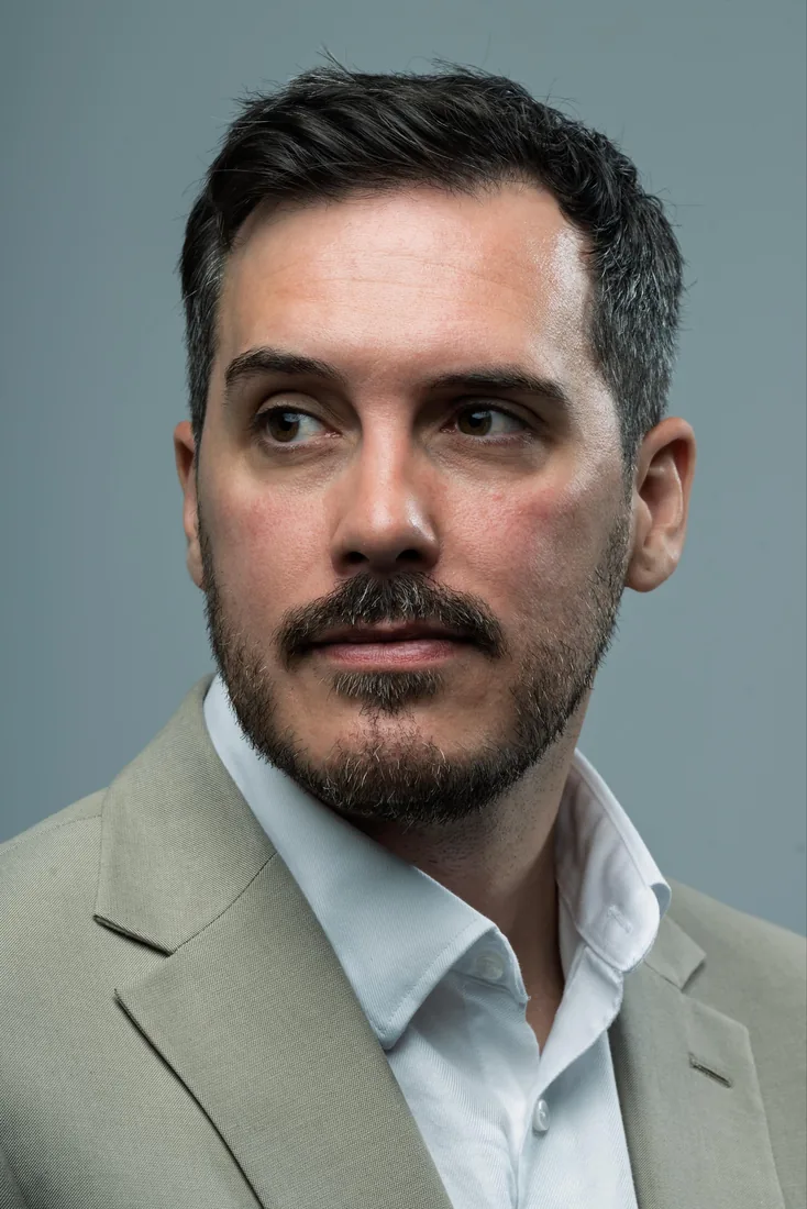
Portraits are among the most useful press images, especially for appointments, awards, expert comment, investment news and milestones. They put a face to a name and give a journalist something that works with a short news item or a longer feature.
The strongest ones feel natural but controlled. That doesn't mean handing someone a hard hat or asking them to point at a clipboard for no reason. It means putting them somewhere that supports the story. A restaurant owner in their dining room before service. A maker at their bench. A founder in a clean, well-lit workspace rather than in front of a row of desks and half-eaten lunches.
For senior people who need a reusable set of images, a straightforward editorial portrait is worth having alongside the contextual one. We usually suggest taking both. The contextual frame tells this particular story; the cleaner portrait covers future announcements, speaker profiles and trade press requests for the next couple of years.
People who aren't used to being photographed often think they need to perform. They don't. Our job is to sort the light, give simple direction and let them settle. What you want is a confident, recognisable version of the person, not an overworked corporate pose.
Product images need scale, detail and context
A product launch needs more than a cut-out on white, though that clean ecommerce frame still earns its place. Press coverage usually benefits from an image that explains size, use or significance.
A new food product may work styled simply with its ingredients, or served as intended. A piece of industrial kit might need to be shown in use, with a person nearby for scale. A new book needs a well-lit cover shot, but the author holding it, or speaking at a launch, is often the frame a local title actually runs. Our guide to product photography that helps products sell goes further into the styling side.
Keep it truthful. An editor will forgive a simple image far sooner than one that makes a product look unlike the thing you can buy. Clean labels, undamaged packaging, current screen content. Small details get very obvious at high resolution.
Shoot variations while you're set up: a horizontal hero, a vertical option, a closer detail. Publications use different layouts and social teams may want a square crop later. Giving them a sensible choice helps. Sending forty near-identical files does not. Two to five well-chosen images is plenty for a standard release.
Event photographs should show energy, not attendance
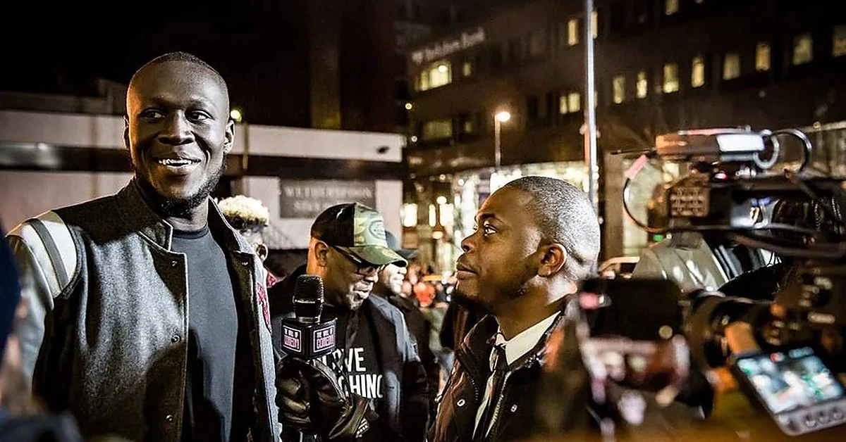
Events are hard because the moment that matters is usually brief. A full room can demonstrate success, but a wide shot of the backs of heads rarely makes a press picture.
Work out the key action in advance. A ribbon cut, an award handed over, a speaker meeting guests, a demonstration, a packed opening night. We plan around that, then look for the supporting frames: reactions, conversation, branded detail, and a wider scene that establishes the venue. That planning is most of what separates useful event coverage from a folder of forgettable crowd shots.
Good coverage balances documentary timing against practical control. We might move someone slightly, ask a group to look up, or find an angle away from the exit signs and the clutter. That isn't faking the event. It's making sure the picture communicates what actually happened.
If children, customers or members of the public are identifiable, build consent into the event plan. Same for staff and guest speakers. A usable image is one you have permission to distribute, not just one that looked good on the night.
Lighting and composition make a business look prepared
Press photography doesn't need to be glossy. It does need to look intentional. Harsh overhead lighting, mixed colour temperatures and an untidy background can make a serious announcement feel improvised.
Natural light can be lovely, particularly for environmental portraits, but it depends on the weather, the hour and the location — and Yorkshire light can go from bright sun to heavy cloud in the time it takes to make a coffee. In the studio, or on location with portable lighting, we get a consistent result without gambling on a grey afternoon or a bright window behind the subject. That matters when a release has a fixed deadline and there's no second chance at an award, a launch or a visiting guest.
Composition earns its keep too. Leave breathing room around the subject. Keep faces away from busy signage. Watch for the lamp post growing out of someone's head. If branding has to be in shot, make it clear but don't let it take over — a logo should support recognition, not turn the photograph into an advert.
Give editors files they can actually use
A good photograph still gets passed over if the delivery is awkward. Editors need high-resolution files, sensibly named and easy to download. Don't send enormous files as email attachments, and don't offer only small images pulled off social media.
Name files so they say what's pictured. Greenfield-Bakery-founder-Jo-Smith-new-Leeds-site.jpg beats IMG_8472.jpg every time. Caption each one with names, job titles, location and what's happening, and check every spelling, particularly names.
Supply a credit line and any agreed usage terms. Press images are often issued for editorial use in connection with that specific story; if you need something different, say so plainly before the files go out. Confusion over rights is an easy way to stall publication.
Keep the captions and the release consistent. If the copy says you've opened a third site, the photograph shouldn't show an old unit with outdated signage. Basic housekeeping, but it protects trust.
.webp)
The images that make a release feel like an advert
The weakest press pictures are over-staged, vague or too sales-led. A cheque handover can be necessary, but it needs decent spacing, readable names and a real expression. Ten people holding branded mugs is not the frame that gets picked up. Stock photography might do for a general blog post, but it gives a trade or local journalist no reason to cover your specific news.
Go easy on heavy filters, artificial background blur and dramatic retouching. A press image should be polished and still believable. Correct the colour, remove the temporary distractions, make people look their best — then stop, well before the result stops looking like the business being reported on.
What works depends on where you want the story to land. A trade title may want the detailed operational shot. A local paper usually prefers the people behind the news. A national desk wants one strong, simple frame it can read instantly. Build the shoot around the likely audience, then hand over a small selection with useful options in it.
A press photograph isn't there to win a photography prize. It's there to make your news easier to believe, understand and publish. When the story, the people and the picture point the same way, the release has a proper chance of being noticed.
Frequently Asked Questions
What makes a good press release photo?
One clear subject, good light and enough room to crop. An editor should understand who or what it's about within a second of seeing it small on screen. If the frame is trying to show five things at once, it usually communicates none of them.
How many images should I send with a press release?
Two to five is usually plenty for a standard release. Include a horizontal option, a vertical or square crop and one detail or portrait. Sending dozens of near-identical files makes the choice harder, not easier.
Can I use stock photos in a press release?
You can, but they rarely help. Stock gives a journalist no reason to cover your particular news, and trade and local editors spot it immediately. A single real photograph of your people, product or premises is worth more than a library of polished generics.
What resolution do press images need to be?
Send full-resolution files rather than anything resized for social media, and use a download link instead of email attachments. Print desks in particular need the detail, and it's easier to scale an image down than to rescue one that was sent small.
Do I need consent for people in press photographs?
Yes, and it's worth sorting before the day rather than after. That covers staff, guests, speakers and any identifiable members of the public or children. A usable image is one you have permission to distribute.
Where is the studio and how do I book?
Dock Street Studio is at Unit 9, 30–38 Dock Street, Leeds LS10 1JF, in central Leeds near Leeds Dock and a short walk from Leeds train station, with parking onsite. Book online, email hello@dockstreetstudioleeds.co.uk, or call 0113 4400102.
Book press photography in Leeds
Whether it's an appointment, a product launch, an award or an opening, we can plan the shoot around the story and hand you a small set of images an editor can actually use. Book online, email hello@dockstreetstudioleeds.co.uk, or call 0113 4400102.
Written by Mark Wheelwright
Commercial photographer & studio owner, Leeds | ISO Photographic Ltd
Dock Street Studio, Unit 9, 30–38 Dock Street, Leeds LS10 1JF
18 years in business | 900+ projects | 300+ five-star reviews | 1M+ shutter count
dockstreetstudioleeds.co.uk
Shot, written and built by the Dock Street team
Every guide on this blog comes from the team at Dock Street Studio — Mark behind the camera with 18+ years' experience, Nicole on styling and lighting, Beya on video and bookings and Austin keeping the site fast and findable. If you'd rather have us do it than read about it, book a session or explore our photography services in Leeds.