


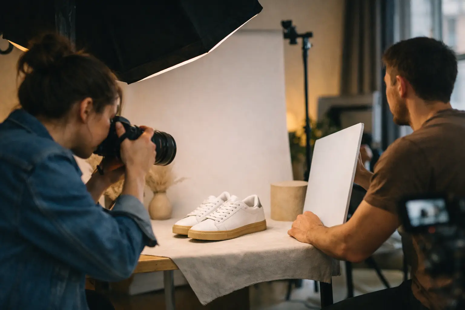
A product can be beautifully made and still look unconvincing online if it's photographed from the wrong side. The best angles for product photography do more than show what something looks like. They answer the questions a customer has before they buy: how big is it, what's it made of, how does it open, and why is it worth choosing over the next one?
There's no single angle that works for everything. A bottle of gin, a pair of trainers and a handmade ceramic mug all want a different approach. What matters is picking views that make the product easy to understand, good to look at, and consistent with how your brand wants to be seen.
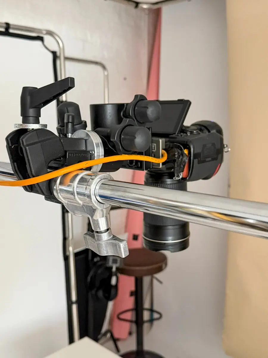
At our Leeds studio we start with the product rather than a pre-set shot list. That's how you avoid images that look polished but don't actually help a sale.
Start with the hero angle
The hero shot does the hardest work. It's usually the first image on the product page, the thumbnail in a collection grid, the frame used in an advert. It has to be clear at postage-stamp size and strong enough to hold up large.
For most products a three-quarter angle is the safest starting point — front and one side at once, camera slightly above. It gives shape and depth without hiding the label, the logo or the main feature.
Straight-on works well for packaging with a bold front design: skincare, food jars, boxed goods. It's clean and graphic. The trade-off is that it can flatten a three-dimensional object, especially if the lighting is flat too.
For something with a distinctive silhouette — a handbag, a chair, a lamp, a bottle — we'll often turn it only a few degrees off camera. That small move reveals the form while keeping the branding readable, and it's usually what separates an average catalogue frame from one that looks considered.

Match the camera height to the product
Camera height changes how customers read an object. It's the quickest way to make something feel premium, practical, imposing or approachable.
Just above the product suits items with important top surfaces — cosmetics, candles, stationery, food, homeware, subscription boxes. You keep the front while giving a proper view of the lid, the contents or the arrangement.
A low angle gives presence. Good for drinks bottles, footwear, tech, furniture, anything with a tall confident shape. Used carefully it makes the item feel substantial. Go too low and you lose the information on top and start distorting the proportions.
Shooting at the product's own eye level is often the honest choice. It works particularly well for bottles, jars and packaged goods where the label wants to sit square to camera, and it's dependable for ecommerce because it makes products easy to compare.
Top-down has its place too — excellent for flat-lay work like clothing, books, jewellery, ingredients and stationery, and for showing a kit or gift set where several pieces need organising in one frame. Taller items lose their shape from above, so it's rarely the only angle we'd supply.
Side views answer the practical questions
A side view is rarely the most eye-catching photograph and often the most useful. Customers use it to judge thickness, depth, fit and construction.
For footwear it shows the sole and profile. For furniture, the shape of the arm, legs and seat. For food and drink, the real size of the jar or bottle. For a notebook, the spine, page depth and binding. All details that take uncertainty out of the decision.
Keep side views clean and consistent. If a range will sit together on a website, matching the camera height, crop and direction makes a real difference — a row of products shot from random angles makes even a good range feel muddled.
Decide which way products should face, too. If an item leans right in one frame, keep that direction across the range unless there's a reason not to. It gives a calmer, more professional grid.
Show detail without losing the product
Close-ups are where material quality earns its keep, particularly when you're selling texture, craftsmanship or a technical feature a full-product shot can't carry.
On a leather bag that's the grain, the stitching, the zip pull. On clothing, the weave, the button, the label, the cuff. On food and drink it might be a foil detail, an embossed mark, an ingredient texture. In every case the close-up should prove something rather than just look arty.
Don't make every detail shot extremely tight. Give the viewer enough context to know what they're looking at — a macro of a fastener works when it sits beside a wider frame showing where that fastener lives.
Lighting matters as much as angle here. Soft light flatters a surface; more directional light reveals texture. Neither is automatically better. Glossy packaging usually wants broad, controlled reflections; rough ceramics and knitwear benefit from a bit more shadow and definition.
White backgrounds are harder than they look
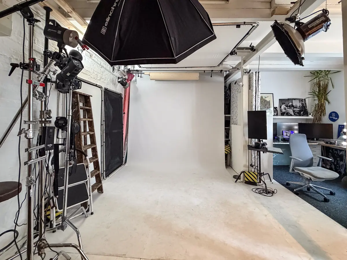
White-background work gets treated as the basic job. In practice it demands discipline, because there's nowhere for poor styling, awkward perspective or messy reflections to hide.
For standard ecommerce we'd usually suggest a front-facing or gentle three-quarter hero, then a side or rear view where it helps, then the key details. Keep the product centred and the lens at a sensible distance — shooting too close with a wide lens bulges the edges and makes packaging look misshapen.
Perspective matters most with boxes, bottles and rectangular products. If vertical lines lean inwards the image reads as amateurish even when the light is good. We get the camera position and lens right first, then correct carefully afterwards if it's still needed.
A pure white background may be a marketplace requirement, but it isn't right for every brand. Some products look better on a very pale grey, a coloured paper sweep, or a subtle set that gives them a bit of grounding. Let the brief decide — a clean cut-out for a shop listing and an editorial campaign frame are doing different jobs. Our guide to product photography that helps products sell covers that split in more detail.
Put lifestyle angles on the shot list
Somebody buying a product is often buying the feeling around it. Lifestyle images help them picture that. They shouldn't replace clear catalogue views, but they add the context that makes a product desirable.
The useful question is: what does this look like when it's being used properly? A coffee cup held at a breakfast table. A skincare product in a bathroom, with believable hands. A piece of office kit on a working desk, with enough space around it that the frame still works as a social post or an advert.
Angles here need to feel intentional rather than accidental. Over-the-shoulder shows use. A lower angle puts the customer in the scene. A close crop feels tactile. But keep the product visible — once it disappears into props, hands and background clutter, the photograph has stopped doing its commercial job.
In the studio we can build controlled lifestyle sets without waiting on a good day outside, which is handy for Yorkshire brands working to a launch date rather than the forecast. It also gives us control over reflections, colour and the small details that pull attention away from the product. Have a look at how we approach product work if you want a sense of the range.
Build the set around customer confidence
Strong product photography is a set, not one brilliant image. A practical starting point for a typical ecommerce product: a clear hero, an alternate angle, a side or rear view, one or two details, and a lifestyle frame where it adds something. More complex products need extra views of controls, interiors, moving parts or configurations.
Before a shoot we ask what customers commonly want to know, and what makes this product different from its competitors. If people need reassurance about scale, we plan for scale. If the selling point is a premium finish, we plan detail frames. If it's hard to understand from one view, we build the sequence around how it's used — which is really just good briefing applied to products.
That planning saves time on the day and hands your web team a set they can actually put to work. Good angles aren't about showing off the photography. They're about making a product feel clear, credible and worth buying.
If you're getting products ready for a shoot: bring them in final packaging, decide which variants genuinely need photographing, and think about the one question each image should answer. We'll take care of the angle, the lighting and the finish from there.
Frequently Asked Questions
What is the best angle for product photography?
A three-quarter view with the camera slightly above works for most products — it shows the front and one side, giving shape and depth while keeping the label readable. Straight-on suits bold packaging; top-down suits flat-lays.
How many angles should I shoot per product?
Four to six covers most ecommerce listings: a hero, an alternate angle, a side or rear view, and one or two details, plus a lifestyle frame if it adds something. Complex products need extra views of controls, interiors or configurations.
Why do my product photos look distorted?
Usually the lens is too wide and too close, which bulges the edges and leans the verticals inwards. It shows up most on boxes and bottles. Stepping back with a longer focal length fixes far more than editing afterwards.
Do I need a pure white background?
Only if a marketplace requires it. Amazon and similar platforms specify white, but for your own site a pale grey, a coloured sweep or a subtle set often suits the brand better and still keeps the product clear.
Should products all face the same way?
Yes, unless there's a reason not to. Consistent direction, camera height and crop across a range make a product grid look calm and deliberate rather than assembled from separate shoots.
Where is the studio and how do I book?
Dock Street Studio is at Unit 9, 30–38 Dock Street, Leeds LS10 1JF, in central Leeds near Leeds Dock and a short walk from Leeds train station, with parking onsite. Book online, email hello@dockstreetstudioleeds.co.uk, or call 0113 4400102.
Book product photography in Leeds
Bring us the products and what each image needs to prove, and we'll plan the angles, the lighting and the set around it. Book online, email hello@dockstreetstudioleeds.co.uk, or call 0113 4400102.
Written by Mark Wheelwright
Commercial photographer & studio owner, Leeds | ISO Photographic Ltd
Dock Street Studio, Unit 9, 30–38 Dock Street, Leeds LS10 1JF
18 years in business | 900+ projects | 300+ five-star reviews | 1M+ shutter count
dockstreetstudioleeds.co.uk
Shot, written and built by the Dock Street team
Every guide on this blog comes from the team at Dock Street Studio — Mark behind the camera with 18+ years' experience, Nicole on styling and lighting, Beya on video and bookings and Austin keeping the site fast and findable. If you'd rather have us do it than read about it, book a session or explore our photography services in Leeds.