


A ring can look exceptional in the hand and oddly flat on a product page. A necklace loses its sparkle, warm gold turns faintly green, and a tiny fastening becomes the one detail a customer can't quite make out. Which is why good jewellery photography isn't about making pieces look nice. It's about helping someone understand exactly what they're about to buy.
That understanding has a commercial job to do. Nobody shopping online can feel the weight of a pendant, test a clasp or hold a stone up to the light. The photographs have to do most of that work. They need to be attractive, yes, but also clear, consistent and believable.
It starts with honest detail
The best image isn't the brightest or the most dramatic. It's the one that shows the piece accurately while keeping enough shape and shine to make somebody want it.
Metals, polished stones and reflective surfaces all behave differently under light. Silver goes grey and lifeless if it's lit too broadly. Highly polished gold picks up dark, distracting reflections. Faceted stones need controlled highlights to show the cut, not a single hard flash that turns them into a white patch. Much of that is the same problem we set out in our notes on photographing reflective products — you're controlling what the piece can see, not just how much light hits it.
We shape the light to build definition around the edges and a gentle reflection across the surface. That's what gives a ring its rounded form, or lets a fine chain separate from the background. Less about adding light, more about putting the right light in the right place.
Sharpness matters too, particularly close in. At macro distances only a thin slice of a piece is in focus at once, so for some frames we combine several focused exposures to get the whole front of the product crisp. Useful for listings, where somebody wants to inspect a setting, an engraving or a hammered texture before committing.
There's a balance to hold. Jewellery should look polished without looking unreal. Heavy editing strips the character out of hammered metal, softens fine craftsmanship, or leaves a stone a different colour from the one that arrives in the post. Retouching should take out dust, marks and stray reflections. It shouldn't misrepresent what's in the box.
What a customer actually needs to see
A clean packshot on a plain background is usually the backbone of a range. It keeps a website consistent and easy to browse, and it suits marketplaces, wholesale line sheets and paid advertising. On its own, though, a single packshot rarely answers every question somebody has.
A useful set normally runs to a front view, a close detail, a side angle that shows depth, and something that establishes scale. For earrings that might mean showing the post or hook. For a bracelet, the clasp and how it sits when worn.
Scale is where hesitation and returns come from. A delicate pendant shot tight looks bigger than it is. A wide ring looks slim from the wrong angle. A hand shot, a model frame or a restrained lifestyle image gives people an instinctive sense of proportion that no dimension in millimetres quite manages.
None of which means every product needs a full editorial production. With a large collection we'd normally build an efficient system around the core packshots, then pick a handful of key pieces for model and campaign work. You get practical coverage for the shop, plus images with some personality for social, launches and press.
Consistency is part of the product experience
Scrolling a collection page, a customer should feel every item belongs to the same brand. Matching background tone, crop, scale, viewpoint and shadow makes the range easier to navigate, and it makes the business look organised.
That matters most if you're adding pieces over months rather than all at once. Getting the first shoot right saves a lot of grief later. We'll set up a reference, agree the framing, and keep notes on lighting, camera position and editing, so the next session follows the same visual system instead of starting from nothing.
Consistent doesn't have to mean bland. Campaign images can be warmer, more expressive, more styled than the catalogue work. The trick is giving each type of photograph a clear job. Listings need clarity. Campaigns need mood. Mixing the two without a plan is what leaves a site looking uneven.

Colour and finish are harder than they look
Jewellery asks a lot of colour. Yellow gold, rose gold and silver all need to read as distinct, and coloured stones have to stay faithful without going dull. It gets harder again when a single product mixes finishes, or shifts appearance under different light.
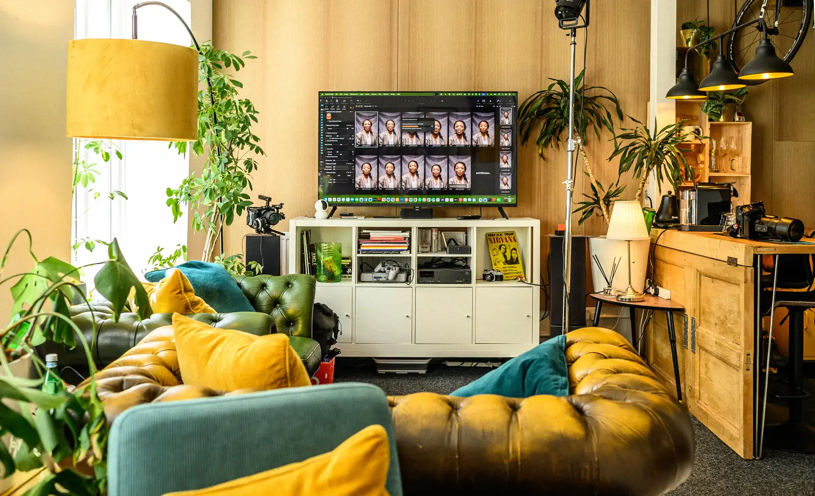
The only sensible approach is to work from the actual item rather than an assumption about what it ought to look like. We check frames as we shoot and edit through a colour-managed process, so the result is dependable. Screens still vary from one shopper to the next — that's not a reason to add avoidable colour shifts at our end. Everything lands on a large screen as we work, which is why we shoot tethered, and it's how a warm gold gets caught drifting before the set comes down rather than afterwards.
Background choice affects colour more than people expect. Pure white suits marketplace requirements and looks clean and modern, but it will also let pale silver vanish without proper edge definition. A softer off-white, a grey or a considered colour can be lovely for campaign work, especially where it supports the rest of the brand palette.
It depends on your sales channels. If a marketplace insists on white-background files, that's your starting point. If you're launching an independent collection with a distinct look, more considered art direction is usually worth the extra time. We often plan both from the outset, so one shoot produces the straightforward assets the shop needs plus a smaller expressive set for marketing.
Preparing for a smoother shoot
Most of the quality gets decided before the camera comes out. Jewellery is unforgiving at high resolution. A fingerprint, a loose fibre or a slightly twisted chain takes longer to correct afterwards than it would have taken to sort on set.
Send pieces clean and separated where you can. Keep pairs together, label variations clearly, and tell us if a particular detail has to be visible. If a ring comes in several sizes but only needs photographing once, say so. If the tone of a stone varies piece to piece, we need to know whether each variant wants its own images.
Agree what “finished” means before the day, too. Shopify product pages, a wholesale line sheet, a social launch, a print advert, all of the above? Square crops, portrait options, transparent backgrounds? That isn't boring admin — it shapes how we frame, light and deliver the work. Our guide to product photography for ecommerce sellers covers more of that planning side.
For model work, casting and styling deserve the same care. Hands should suit the brand and the size of the piece. Clothing needs to support the jewellery rather than compete with it — a heavy pattern or a glossy fabric will pull focus off a fine necklace in seconds. We keep the set-up comfortable and unfussy, particularly for founders and team members who aren't used to being photographed. You don't need to arrive knowing how to pose. That's our job.
Judging the results after delivery
When the gallery lands, look past the first frame that catches your eye. Can a buyer identify material, finish, size and the key details quickly? Put similar products side by side — do they feel like one coherent range? Look at them on a phone as well as a large screen, because that's where most people will see them first.
Then think about how hard the files will work. Good product photography should carry your shop, your emails, your social content, press requests and print. A well-planned shoot gives you a library rather than a handful of nice pictures.
If you're not sure where to start, begin with the pieces that sell most, launch first, or need the most explaining. Once those are working properly you can build the rest of the collection to a standard that's already set. That's usually kinder to the budget and to the brand, and it gives every new piece a fair chance of being seen properly. Bring a few items in and we can talk it through properly over a brew.
Frequently Asked Questions
How many images does a piece of jewellery need?
Usually four or five. A front packshot, a close detail, a side angle showing depth, something that answers scale, and a worn or model frame for the pieces you push hardest.
Why does my gold look the wrong colour online?
Almost always a lighting or white balance issue rather than the camera. Warm metals pick up colour from everything around them, so the set has to be controlled and the editing colour-managed.
Do I need a model, or will a hand shot do?
A hand shot handles scale for rings, bracelets and earrings perfectly well and costs far less. Full model work earns its keep for campaigns and necklaces, where drape and placement matter.
Can you match a shoot we had done previously?
Often, if the earlier images are decent quality. Send examples and we'll be honest about what's matchable. Sometimes reshooting the older pieces works out cheaper than fighting to match them.
Should the background be pure white?
If a marketplace requires it, yes. Otherwise a soft off-white or light grey often serves silver and pale metals better, because pure white can swallow the edges of a delicate piece.
Where is the studio and how do I book?
Dock Street Studio is at Unit 9, 30–38 Dock Street, Leeds LS10 1JF, in central Leeds near Leeds Dock and a short walk from Leeds train station, with parking onsite. Book online, email hello@dockstreetstudioleeds.co.uk, or call 0113 4400102.
Book a jewellery shoot in Leeds
Bring your best-selling pieces, the pages they need to fill and an honest list of what your current images don't answer, and we'll build a standard you can repeat as the collection grows. Book online, email hello@dockstreetstudioleeds.co.uk, or call 0113 4400102.
Written by Mark Wheelwright
Commercial photographer & studio owner, Leeds | ISO Photographic Ltd
Dock Street Studio, Unit 9, 30–38 Dock Street, Leeds LS10 1JF
18 years in business | 900+ projects | 300+ five-star reviews | 1M+ shutter count
dockstreetstudioleeds.co.uk
Shot, written and built by the Dock Street team
Every guide on this blog comes from the team at Dock Street Studio — Mark behind the camera with 18+ years' experience, Nicole on styling and lighting, Beya on video and bookings and Austin keeping the site fast and findable. If you'd rather have us do it than read about it, book a session or explore our photography services in Leeds.