


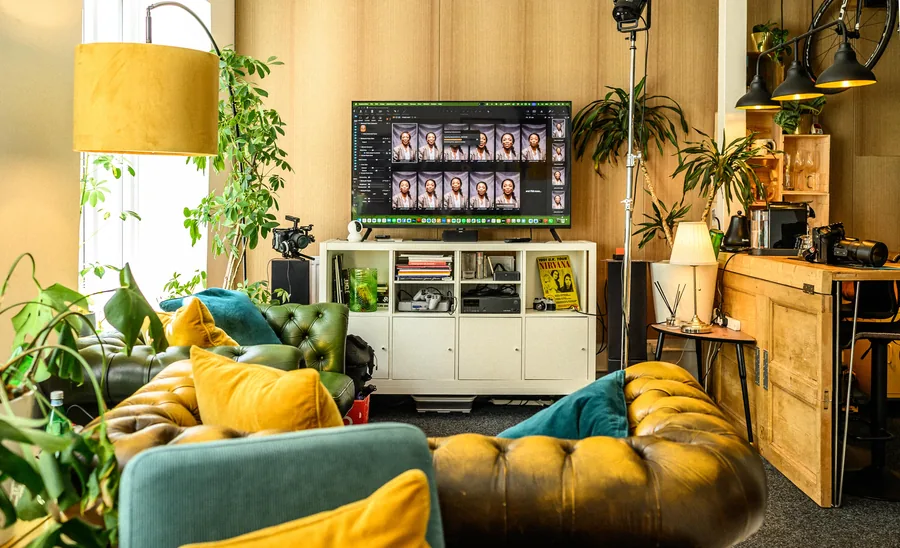
A product can be well made, sensibly priced and exactly what somebody needs, and still sit in a basket because the photographs leave too much unanswered. This ecommerce photography case study looks at a problem we see often with growing brands: decent stock, steady sales, but a website that doesn't yet show the product clearly enough to make buying feel easy.
The example below is drawn from the sort of project we handle regularly for independent product businesses. Some details have been changed to keep the client's business their own, but the thinking, the workflow and the lessons are exactly what we'd apply here in Leeds.
The brief: make a growing range look established
The client was a Yorkshire homeware brand selling small-batch ceramic tableware online. The products had real character — each piece hand-finished, with small differences in glaze and texture. That variation was part of the appeal. The trouble was that the existing images made it look accidental rather than intentional.
They'd started with photographs taken at home and a few supplier shots. Some were warm, some cool, some on white, some on a kitchen table. The same mug looked like a different mug from one product page to the next. Customers could get the general idea, but not the scale, the finish, or how much one piece varied from another.
The brief wasn't to make the range look glossy for its own sake. It was to build a dependable set of images that could carry product pages, social posts, press enquiries and seasonal campaigns — and a process the client could repeat as new stock arrived. That last part matters more than people expect. Good ecommerce photography isn't one strong hero shot. It's a system that still holds together at 10 products, 50 products, 500 products.
What was actually costing them sales
Before any shoot, we look at the customer's questions rather than reaching straight for a lighting diagram. For this brand the gaps were fairly plain.
Shoppers couldn't judge size quickly — a bowl looked generous in one photo and modest in the next. The hand-made finishes were being flattened by hard light and heavy editing, so the thing that made the range worth buying barely showed. And there was no visual rhythm on the collection pages; scrolling the range didn't feel like one considered brand.
None of that means the original photographs failed. They did their job while the business found its feet. But there comes a point where the photography has to catch up with the product.
We also had two competing needs to balance. White-background images make comparison easy and keep a shop looking tidy. Lifestyle images add warmth and help someone picture the thing in their own kitchen. Leaning entirely on either leaves something out, so we gave each image type a clear job — much the same argument we set out in our notes on lifestyle versus packshot photography.
Start with a shot list, not a mood board
A mood board is useful for agreeing a feel. It won't stop you missing images on the day. We built a practical shot list for each product family: a front-on packshot, a three-quarter view, a close crop of the glaze, the base or maker's mark where it mattered, and a scale reference.
For the key lines we added styled frames showing pieces in use. A mug beside breakfast on a clean table. A serving bowl with food in it, styled quietly enough that the bowl stayed the point of the picture.
We also grouped products by size and finish before the shoot. It sounds basic. When you're photographing forty similar items, a missing colourway or an unplanned size is exactly what eats the afternoon.

Light the material, not just the background
Ceramics are awkward in a specific way. Curved surfaces catch reflections, and glazes need some direction in the light to show any texture at all. Light them flat and they look dull. Use a small hard source and every reflection turns into a distraction.
We used large, softened light to give the pieces a natural shape, then controlled the reflections by moving things rather than adding more kit. White cards lifted the darker areas without washing out the depth of the glaze. For a couple of the darker finishes we changed the angle instead of turning the power up.
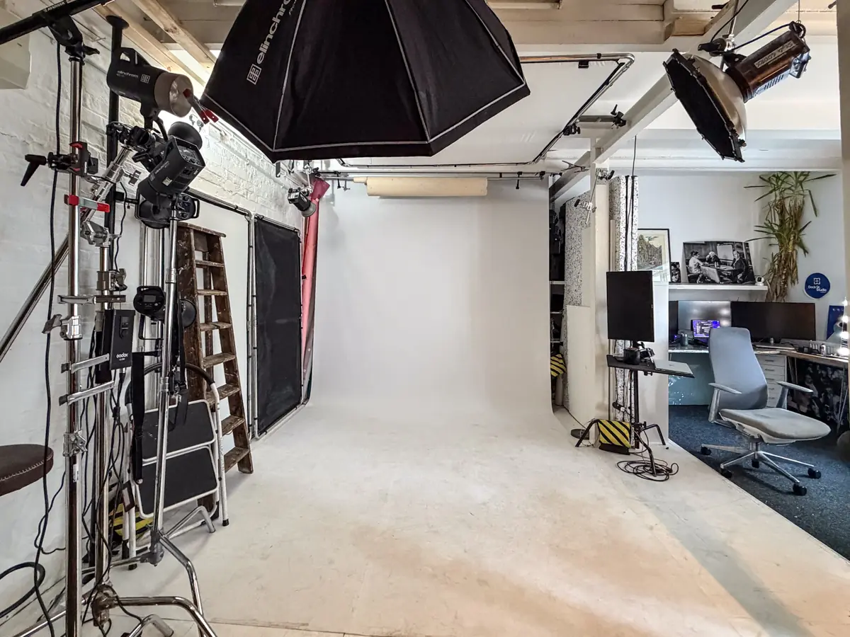
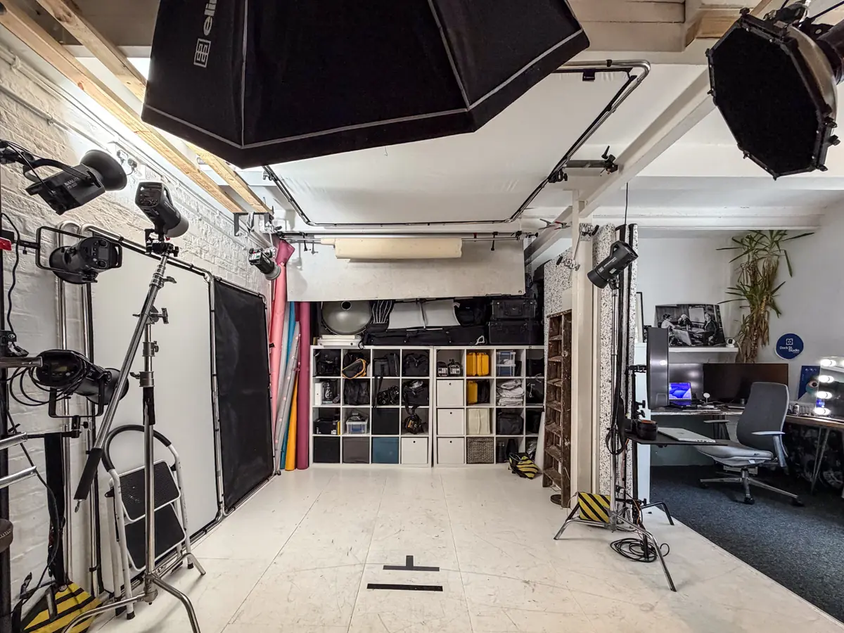
This is where a proper studio earns its keep, and it isn't about owning the most equipment. It's being able to control the light, judge the result honestly on a big screen and repeat it all day. A bowl photographed at ten in the morning should sit comfortably next to one photographed at three.
Keep the background honest
The client wanted clean cut-outs for the website without an over-processed look. We shot against a bright neutral background with enough separation at the edges for accurate retouching, so the final images came back clean and consistent while the product kept its real colour and surface.
That distinction is worth protecting. Retouching should take out dust, marks and distractions. It shouldn't turn a hand-made object into something the customer wouldn't recognise when they open the box. If natural variation is part of what you're selling, show it and say so on the page.
Showing scale without making a fuss
Scale references are easy to get wrong. A stray hand in shot or a ruler laid alongside will answer the question, but it can wreck the look of an otherwise tidy product page.
For this range we used familiar table settings and a few carefully chosen props. A small bowl next to a standard teaspoon reads instantly. For the bigger serving pieces, an overhead styled frame showed how much food they'd actually hold. Dimensions still belonged in the copy — the photographs just did some of that work before anyone scrolled far enough to read it.
Delivering images built for real use
We handed over the photographs in planned sets rather than one large folder of vaguely named files. Each product had a consistent group of web-ready images, with separate high-resolution versions for print, press and future campaigns.
Naming and cropping aren't glamorous, but they decide whether a small team can update a product page in five minutes or spend an hour hunting. Consistent crops also stop collection pages looking like they've been assembled from three different brands.
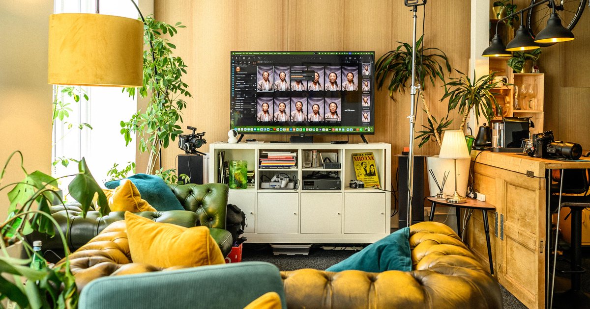
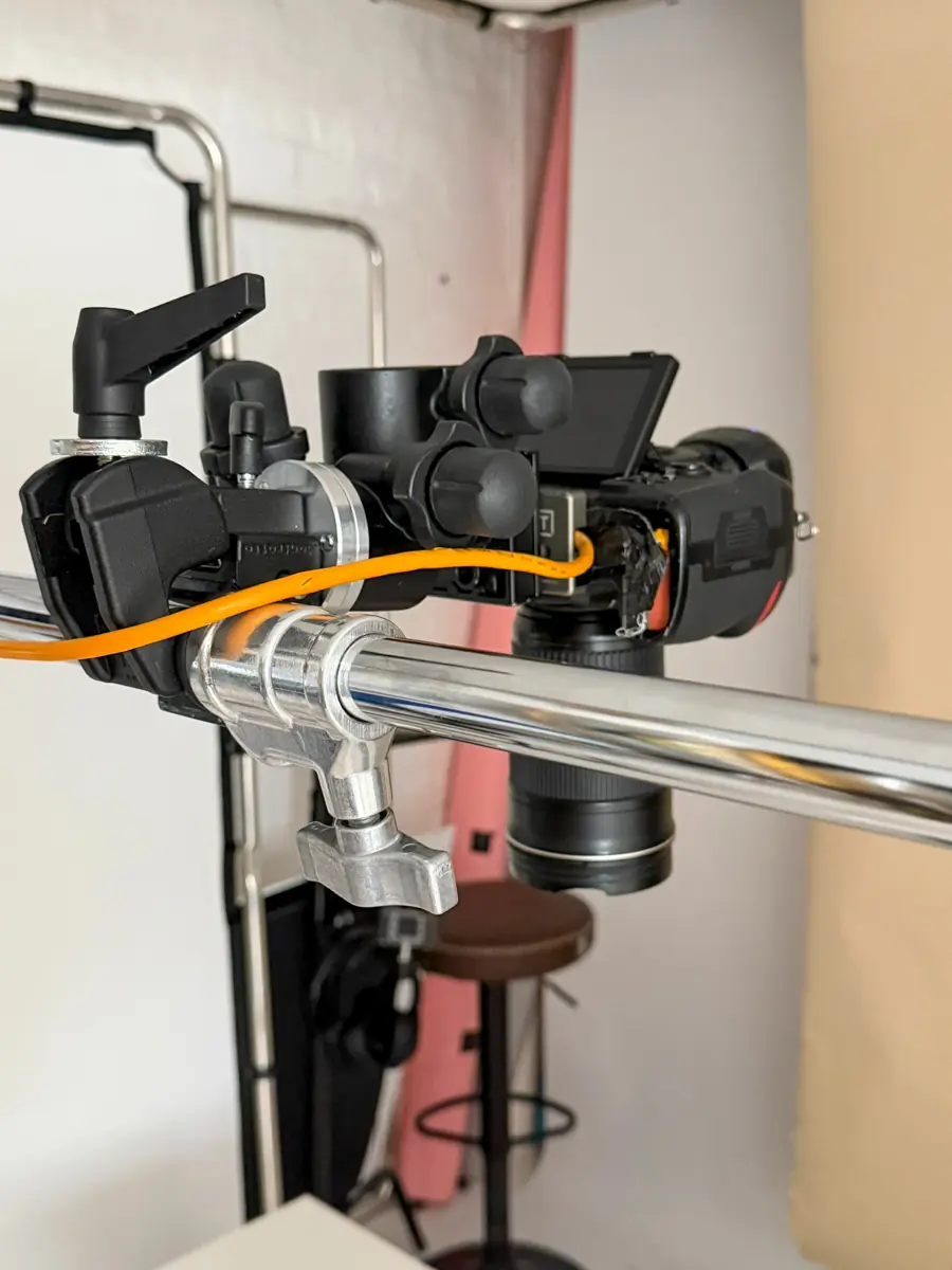
We agreed orientation before shooting, too. Square and portrait crops suit different layouts and social formats, and cropping after the fact often removes the detail that made the frame useful. Everything lands on a big screen as we work, which is why we shoot tethered — the client can see a crop working or not working while the set is still standing.
What changed afterwards
The first difference was confidence. The client could put the collection in front of retail buyers and press contacts without apologising for the pictures. The social feed looked coherent. The product pages answered more of the questions people had been asking before they bought.
We'd never claim photography alone moves a particular sales figure. Price, delivery, descriptions, reviews and site speed all play their part. But clearer images reduce hesitation, and hesitation is where baskets get abandoned.
The project saved effort in less obvious places as well. The team stopped answering the same questions about size and colour in direct messages. Newsletters and seasonal content had a reliable bank to draw on. New launches stopped being a scramble, because the standard was already set.
What to take from this if your shop has outgrown its photos
You probably don't need a large campaign production. Start with the best-selling or most profitable range, get the core product photography genuinely right, see how it performs, then build outwards.
Be clear about what your customer needs to see. For some products colour accuracy is everything. For clothing it's fit and how the fabric moves. For food, texture and portion size will sell harder than a perfectly white background ever will. There's no single formula — but there should be a reason behind every image on the list. Our guide to product photography for ecommerce sellers goes further into the planning side.
If you're looking at your product pages thinking the stock deserves better than the pictures, bring a few examples, your current site and a clear idea of what's not working. We can talk it through properly over a brew and work out a sensible first shoot from there.
Frequently Asked Questions
How many images does each product need?
For most shops, three to five. A front-on packshot, a three-quarter view, a detail crop and something that answers scale. Add a styled lifestyle frame for the lines you push hardest.
Should I use white backgrounds or lifestyle shots?
Both, with different jobs. White backgrounds make comparison easy and keep collection pages tidy. Lifestyle images build desire and show scale in context. Neither is automatically better.
How long does an ecommerce shoot take?
It depends far more on the number of setups than the number of products. Forty similar items in one lighting setup can move quickly. Ten products each needing their own styling will take longer.
Can you match photography we already have?
Usually, yes, if the existing images are decent. Bring examples and we'll work out what's matchable and what's honestly better replaced. Sometimes reshooting the older lines costs less than fighting to match them.
Do you help with the shot list, or do I need one ready?
We'll build it with you. Turn up with the products, the pages they need to fill and any formats you're committed to, and we'll turn that into a workable list before the camera comes out.
Where is the studio and how do I book?
Dock Street Studio is at Unit 9, 30–38 Dock Street, Leeds LS10 1JF, in central Leeds near Leeds Dock and a short walk from Leeds train station, with parking onsite. Book online, email hello@dockstreetstudioleeds.co.uk, or call 0113 4400102.
Book an ecommerce shoot in Leeds
Bring us your best-selling range, the pages it has to fill and an honest list of what your current images don't answer. We'll build a shot list and a standard you can repeat. Book online, email hello@dockstreetstudioleeds.co.uk, or call 0113 4400102.
Written by Mark Wheelwright
Commercial photographer & studio owner, Leeds | ISO Photographic Ltd
Dock Street Studio, Unit 9, 30–38 Dock Street, Leeds LS10 1JF
18 years in business | 900+ projects | 300+ five-star reviews | 1M+ shutter count
dockstreetstudioleeds.co.uk
Shot, written and built by the Dock Street team
Every guide on this blog comes from the team at Dock Street Studio — Mark behind the camera with 18+ years' experience, Nicole on styling and lighting, Beya on video and bookings and Austin keeping the site fast and findable. If you'd rather have us do it than read about it, book a session or explore our photography services in Leeds.